Update: Fabian Jakobs has ported the Qt/C++ code to HTML Canvas and JavaScript, runnable inside a web browser.
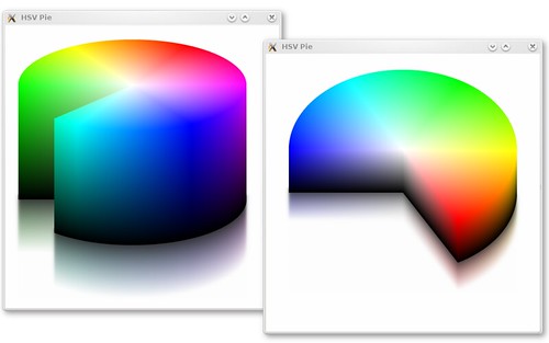
I was having headache fiddling with some fragment programs when Helder (of SpeedCrunch fame) asked me an innocent question that eventually triggered me to write the Graphics Dojo example for this week: rendering the well-known HSV cylinder in 3-D. At first, I thought using a fragment program is the perfect solution, but considering that we are Trolls, let us write a pure Qt solution that works everywhere. So check out the code!
Unfortunately, in its current state, the code is not really optimized for (near) real-time rendering. If it would have been fast enough (which I guess not really feasible with a non-OpenGL solution), we could have used it for a fancy color picker. Why use a 2-D color picker/dialog when you can have a 3-D one? I'm sure once the 3-D version is introduced, the 2-D version quickly becomes confusing for any creature on this planet.
The question now: shall I do the HSL sphere?

7 comments:
wow, ariya, that looks great. is there any chance that the glow effect will make it into koffice? that could add a lot of awesomeness to kchart. beautiful, well done *cheer*
yes, you should do the spear
doh. *sphere
@Anonymous: effects can be integrated later when KOffice 2.0 is released.
@R. James: then I need to think about the correct rendering trick :-)
Ariya, please do a *zooming* hsv selector ;)
So if I try to select something it slowly zooms in for me to pick even more accurately the exact color I need. This would get rid of the always present widget next to a color picker that shows a bit area of the color you selected.
I don't know if anyone has already thought of this, but I think it would be really cool to make a colour selector widget using this. The way I imagine it is that it would show a cylinder with a wedge cut out, like above, but it would have some sort of 'handle' or something so that the cylinder was rotateable. The wedge would remain in the same place but the cylinder would rotate, causing it to show a different section of the cylinder at it was rotated. Then you could click somewhere on the side of the wedge to pick the colour you wanted. I don't know if that's understandable, but the way I think of it in my head, it makes sense and would be a much more intuitive interface than the one like we see in e.g. kcolorchooser (not to pick on it, it just comes to mind first).
er, I feel like an idiot. You just mentioned colour pickers in the post....
Post a Comment